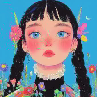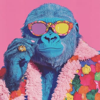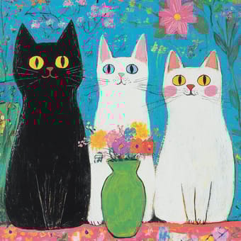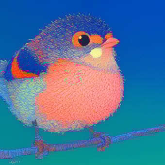


Дополнительные советы
Вы можете исследовать дальше, комбинируя следующие команды:
- --s: Значение по умолчанию 100, может быть установлено от 0 до 1000. Более высокое значение создает более детальные изображения и стили, которые ближе к реальности.
- -niji 6: Использование этой команды даст изображению более анимированный стиль.
- --sw: Значение по умолчанию 100, может быть установлено от 0 до 1000. Более высокое значение делает стиль ближе к оригиналу.
- --sv: В Midjourney версии 7 при использовании изображений есть шесть версий функции Style Reference. Используйте параметр --sv для выбора между ними. --sv 6 установлен по умолчанию. --sv 4 - это старая модель sref V7 (до 16 июня 2025 года). Использование --sv 6 и --sv 4 может привести к различным стилевым результатам.
- --sref 123 456: Теперь вы можете смешивать несколько кодов --sref.
- --sref 123::2: Вы можете установить индивидуальные веса для отдельных кодов или URL.
- You can also read more guides on Руководство для использования стилевого кода SREF